okay well herez a very small colly i thru together so dont expect much from it
nevertheless...please dont rip any of these as they are for my board only..and
imagine how boringer bbsing would be if more than 1 board used the same shit!
anyway....i havent been getting many requests lately...so if you need any pics
or fonts for your board feel free to ask....isotone@netspace.net.au or my board
i usually do better work than this...so dont judge me by these fonts
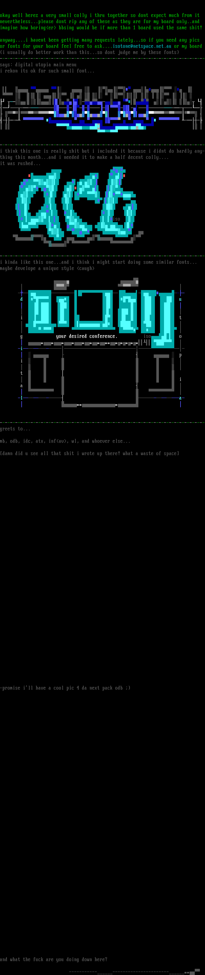
--------------------------------------------------------------------------------says: digital utopia main menu
i rekon its ok for such small font...
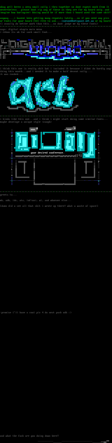
--------------------------------------------------------------------------------i think this one is really shit but i included it because i didnt do hardly any-thing this month...and i needed it to make a half decent colly....
it was rushed...
iso
--------------------------------------------------------------------------------i kinda like this one...and i think i might start doing some similar fonts...
maybe develope a unique style caugh
d u
i t
g your desired conference. iso o
i
p
i
t
i
a
l a
--------------------------------------------------------------------------------greets to...
mb, odb, idc, atx, infav, wl, and whoever else...
damn did u see all that shit i wrote up there! what a waste of space
-promise ill have a cool pic 4 da next pack odb
and what the fuck are you doing down here?
nevertheless...please dont rip any of these as they are for my board only..and
imagine how boringer bbsing would be if more than 1 board used the same shit!
anyway....i havent been getting many requests lately...so if you need any pics
or fonts for your board feel free to ask....isotone@netspace.net.au or my board
i usually do better work than this...so dont judge me by these fonts
--------------------------------------------------------------------------------says: digital utopia main menu
i rekon its ok for such small font...
--------------------------------------------------------------------------------i think this one is really shit but i included it because i didnt do hardly any-thing this month...and i needed it to make a half decent colly....
it was rushed...
iso
--------------------------------------------------------------------------------i kinda like this one...and i think i might start doing some similar fonts...
maybe develope a unique style caugh
d u
i t
g your desired conference. iso o
i
p
i
t
i
a
l a
--------------------------------------------------------------------------------greets to...
mb, odb, idc, atx, infav, wl, and whoever else...
damn did u see all that shit i wrote up there! what a waste of space
-promise ill have a cool pic 4 da next pack odb
and what the fuck are you doing down here?
FILE
PREVIEW
SAUCE
- title
- few shitty fonts...
- author
- isotone
- group
- Shaolin's Finest
- date
- 1998-01-16
- comments
- datatype
- character
- filetype
- ansi
- filetype info
-
width: 80
height: 158
font:
icecolors: no
letter spacing: not specified
legacy aspect: not specified
META - TAGS
- artist(s)
- group(s)
- content
copy tags navigation report a problem
log in to add a comment.