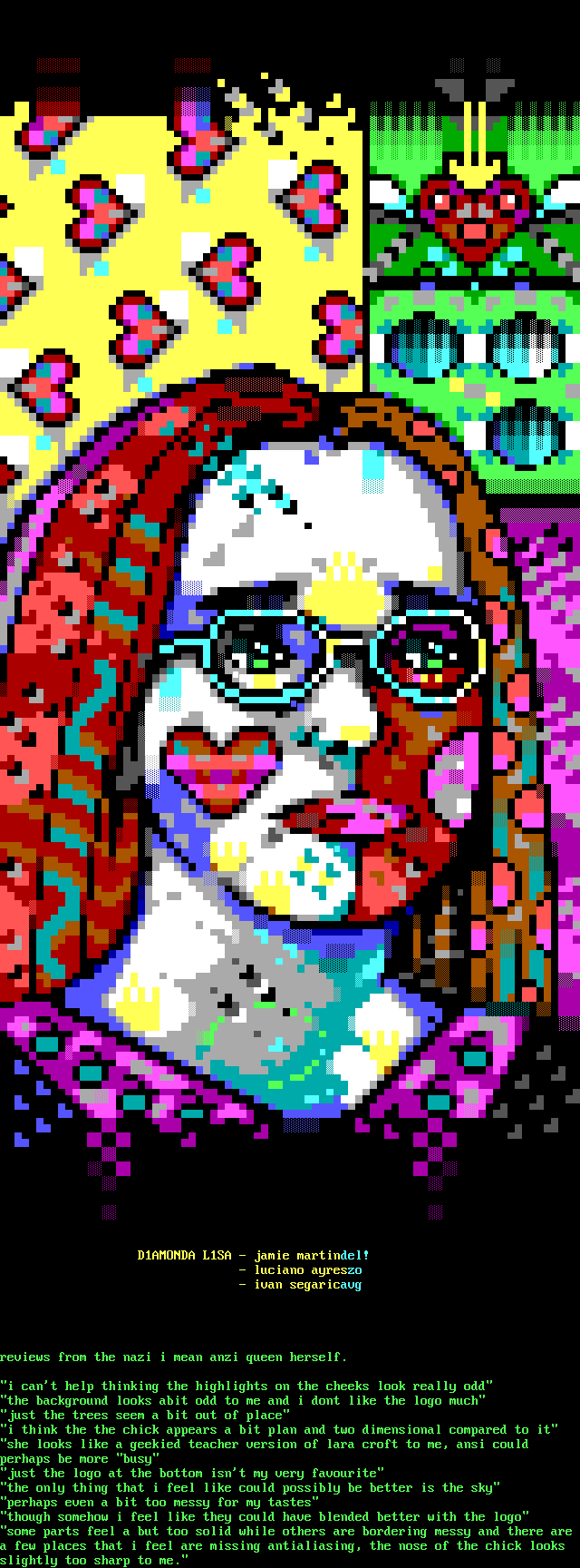
D1AMONDA L1SA - jamie martindel!
- luciano ayreszo
- ivan segaricavg
reviews from the nazi i mean anzi queen herself.
i cant help thinking the highlights on the cheeks look really odd
the background looks abit odd to me and i dont like the logo much
just the trees seem a bit out of place
i think the the chick appears a bit plan and two dimensional compared to it
she looks like a geekied teacher version of lara croft to me, ansi could
perhaps be more busy
just the logo at the bottom isnt my very favourite
the only thing that i feel like could possibly be better is the sky
perhaps even a bit too messy for my tastes
though somehow i feel like they could have blended better with the logo
some parts feel a but too solid while others are bordering messy and there are
a few places that i feel are missing antialiasing, the nose of the chick looks
slightly too sharp to me.

log in to add a comment.