
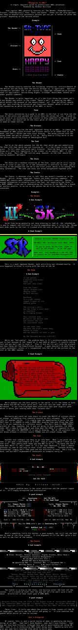
Blueprint to ANSi A simp
le, beginers guide to professional ANSi structure. Produ
ced by Shihear Kallizad Your typical ANSi generally
consists of: The Header, Poem/Optional,Picture, Poem/Opt
ional, Font, Stats and Footer. Poems are not only optional
but theyre denoted with parathesis because you can put it before
or after thepicture, depending on the desired effect.
Example:
The Header -
Do
nt worry... Be....
- Poem
Picture
- Font
blah blah blah blah blah
Stats - blah blah blah blah blah
blah blah blah blah blah
cBlah Blah Blah Blah!! - Footer
The Header
The Header usually contains the following information: Initia
ls/Handle of
the Artist and the Group that the Artist belongs to, if applicable.
Optional
information includes, but is not limited to: Copyright Information on
picture
used if applicable, Artist/Group Rights, Filename, Board Name, Gree
ts or
other general comments.
The Header is quite important, as its the first thing the viewer
sees.
A bad Header may result in the viewer Spacen out, or aborting the
ANSi,
which defeats the purpose of the Advertisement, no? Time and effort
should
be put into crafting an atractive yet functional header, which is aft
er all
the foundation on which the rest of the ANSi is built.
Poem
The basic attraction to a poem in an ANSi is the fact if can
help set the
tone of the piece alot quicker and easier than the actual Art can. A
poem is
to be used as an accessory to the visuals to help compelete the image
ry of the
whole piece, and should not be the focal point of the piece or the ma
in tool
in mood or theme setting.
The Picture
The picture is by far the most important thing of an ANSi. I
n almost any
breakdown of ANSi places Picture and Picture choice as at LEAST half
of the
work, and thats before you even start drawing. The wrong picture wi
th the
wrong theme and youve screwed it all up. Daffy Duck w/ a big smile
is not
the picture choice for Plane of Unmidigated Evil.
The Font
Youre at the whole purpose for the Ad, that which you are ad
vertising.
The Font *IS* that which you are focusing on. Its the Climax to the
whole
piece. To fall short now could spell disaster. Even the best pictur
e ever
drawn will seem less impressive to the viewer, as an overall ANSi, if
the
font is weak. Dont get TOO carried away, however, as the font shoul
d be
easily readable, definable.
The Stats
The Stats are a mundane extention of The Font, since youre s
till trying
to be as clear as you can, as if the information is difficult to read
, youre
failing in the purpose for the Ad in the first place, which is to con
vey this
very information. The font and stats are often encoperated together
with:
The Footer
The Footer is whatever else is left that you havent touched
on in The
Header. Artist, Group, Copyright, Greets and other varrious comments
. It
SHOULD NOT contain more information than the Font/Stats combined. Ha
ving
enough information to actually scroll the Font, but especially the St
ats is
a HUGE *NONO*, since youre underminding the function of the ANSi for
a bunch
of useless prattle, in so far as the person the Ad is for may happen
to be
concerned.
Examples:
The Header
A Bad Example
. . A
12 .
. 92
P r e s e n t s
P r o d u c t i o n
tm
. Advertise
ments .
Aside from being generally not very pleasing to look at, the
information
is way to compact and difficult to easily comprehend when it scrolls
by. Things
were made worse by the fact it clashed with the rest of the Ad SK-SK
Y1.ICE.
A Good Example
Shihear
Kallizad TRiBE Production 93
SK-HELL1.TRI
: Hellbound June 30th, 1993
If youre gonna do the
time, might as
well do th
e crime! - To da iCE guys.
Want one? Call HardWired @ 4O445273
87
or contact me via ToXiCNet/Interpool/C
Ci
This is a much improved Header, both artisitcly and informati
onally. It
also happened to blend in nicely with the rest of the Ad.
The Poem
A Bad Example
In the ground,
A hurried wind blows,
Under ice,
And over lava flows.
From the floor,
Sprays crimson fire,
Shaping rocks
As Hell desires.
Overhead,
Is a sight serene:
Jagged fingers of ice,
Emerald green.
The ceilings chill,
And the floors cruel heat
Is separated
By a singing breeze.
This constant wind
Maintains the molten rock,
And ensures the ice
Its consistent stock.
So come down soon,
And hear the winds sweet song,
Before it stops
And the Emerald Ice Cave is gone.
By The Retarded Warrior iCE-Lit
While not bad poetry, the problem here is its uninterestin
gly displayed
and in fact because of the length of it and LACK of detail, it scroll
s really
fast and you dont get to read it. Plus it did not fit well with the
picture,
and thus threw off the Poem/Picture balance. A poem shouldnt be mor
e than a
single screenfull, unless its incoperated into the art of the pictur
e or the
rest of the ANSi somehow.
A Good Example
The Time has Come and Hes Hellbent.
An Angel of Death but not Heaven Sen
t.
Conceived
of Sin and Brimstone Born.
Pray youre Never Caught i
n This Hellstorm.
A Vessle of Flesh for a So
ul of Hate.
Appoi
ntments Been Made, Hells Firey Gate.
The Son of Satan a
nd a Prince of Lies.
It
s Judgement Day, no Evil Survives.
When Innocence Lost, its Vengence Found.
The Journeys not Over youre Just . . .
While perhaps not the best poetry in the world, it fit
the theme of both
the Board and the Ad itself quite well, and tied into the name, which
was
Hellbound. It was also displayed more creatively than your atypical
poem,
which is often just nothing more than colored text.
The Picture
Obviously you could not even begin to cover the BASICS of pic
ture choice
or useage, or anything else remotely covered by this catagory. That
s best
left for another series. Ill simply take the oppertunity to point o
ut the
FACT that it is HARDER to make a GOOD ANSi drawing from your Minds Ey
e than
it is to use something as a refrence source. You dont have to DRAW
*THAT*
picture of, say, Superman, but if you are going to draw Superman, for
GODS
sake, BUY a copy of the book so you know what the FUCK its supposed
to look
like. Same goes for WHATEVER it is youre drawing. 90 of the pictu
res that
are drawn without a refrence source *SHOW* and are almost always BAD.
The Font
Another vast subtopic too deep to go into here. What I can p
oint out is
that if you want a bad example of a font, look at anything RELiCs do
ne so far
font wise. That pretty much shows you how NOT to do it. To those w
ho dont
know what REliC is, dont sweat it, its not that important. Fonts
should
pleasant to look at and easy to read, first and foremost. Colored C
hicken
Scratchings simply dont look good and are difficult to read. Dont
try TOO
hard, and use ASCII Alphanumeric characters as examples early on.
The Stats
A bad example
- Free B
eer BBS -
Sysop: Ki
llean ACiD
Member Board
CoSys: Bu
d Weiser BeerWare
c Utils
- Running
Latest Renegade -
4o4 3
51 4529
A N S i B y : K i l
l e a n A C i D
The biggest problem here is the color selections and the gene
ral layout
of it. Its simply uninspired and unattractive.
A good example
Art: Sanctuarytm: 3
o5.792.8771
Files: S2The Sequel:
3o5.755.9o68/
93o8
Sys: Tempus Thales
iCE SysOp:
Tempus Thales
CoSysOp: Slam Dunk iC
E : MD, FFO, TUS
iCE U.S. Headq ACiD
FL Outpost THG Afilliate
CSC Dist Site
MiR Southern Hq DeAD Dist S
ite MALiCE Affil. PPC Dist Sit
e
TEI Southern Hq Psychosis Dist
0 to 1 Day Utensils CCI Net
THE World Hq CCI Net
TCS Net - Your Afilliation Here
Part I: USR 14.4 DS /
2oo- Megs Part II: U
SR 14.4 DS, 4oo+ Mb
Why the FUCK ar
ent you in Sanctuarytm?
ANSi: MaRShaL LaW i
CE 1993
Happy Holidays
Heres something little bit better, a good example, but still
not the best
due to some of the color useage. It also happened to fit the ANSi qu
ite a bit
as well as the feel of the boards.
The Footer
A bad example
BTW: Watch for Relentless!
Staff Members:
STiLE, Shinobi, Eternal Darkness, Psycho Slasher, Metal
Head
Psychosis Canadian Headquaters
iCE/SWaT Affiliate Site
ACME-NET World Headquaters
CyberCrime Net -/- InterPool Net -/- Paramount Net
0 Day Wares No Local Callers
4167647208
I spent more time on the fonts than on the picture 07/09/93
and they both look like shit
Greets: Miguel, Harvey,Yonn, Nhon, Brian, Selvin, Adrian,
Angel, Chris, Denise, Karen and all my fellow buds at Harveys.
Valiant was the best... thanx QS and HV. ACID will be fun too..
Jeff Steve - best buddies a bbser could have :
ICE. Good Luck ! Hi...
T h e E v o l u t i o n a r y S h a d o w
A C
I D
The footer is as big as the stats, and basicly scroll the fon
t off the
screen. Its a bunch of stuff that the guy the ads for wont give a
shit
about. Alittle bit of that stuff goes A LONG WAYS.
A good example
Original Picture from the Cover of the August Issue of Incredi
dble HULK 408
The Incredible HULK Copyright c Marvel Comics Group. All Rights R
eserved.
ANSi Copyright c1993 By Shihear To Sexy For This ANSi Kallizad
of TRiBE
Three lines. It tells you where the picture is from, covers
all the BS
on Copyrights, and tells who the artist and group is. It also contai
ns the
quotes which artist so love to include.
Just a blueprint
Of course, this is just a quick review of what is generally t
he basic
design of an ANSi. Some dont have Headers, some dont have Footers.
Some
may not even have Pictures, although then youre questionably not doi
ng AN
ANSi, even if it is technically ANSI Codes being used. Hopefully thi
s will
give you some basic knowldge from which to build apon.
log in to add a comment.